You know the old, familiar drill. So many numbers to report, but so little time! Use these handy hints to get your message across more clearly and quickly.
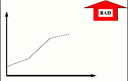
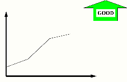
You know the details, your audience doesn't. Show the trend with a line chart or a bar chart. And tell whether the trend is good or bad, like these examples. In baseball, higher scores are good. In golf, higher scores are bad.
My Golf Score
 Home
Runs Hit By My Team
Home
Runs Hit By My Team
No one but you remembers if "Gamma" should be going up or going down. If you and Einstein are the only people in the world who understand how the Double Derivatives of Gamma Factor are constructed, a good/bad arrow added to the chart helps your audience get your point about the trend. So, you can spend your time explaining how to fix it rather than explaining how to measure it.
Double Derivatives of Gamma Factor
Your chart shows only this month's information, with entries like this:
Monthly Sales Report
| Sales | $30,000 |
Is $30,000 good? It depends. What was your goal? Are your trends moving toward the goal?
If the 12-month trend has been $500,000/month, then $30,000 this month is bad news. If the 12-month trend has been $1,500/month, then $30,000 is very good news. Unless your audience is very familiar with the details for your measures and goals, use a trend chart rather than a single number to put the $30,000 in perspective.
Like this:
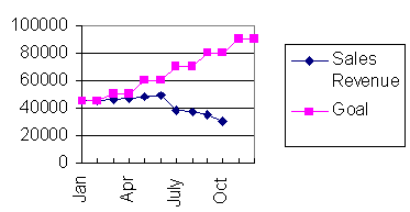
Reports showing only the current snapshot of month or quarter -- without showing the trend -- don't tell a full story. If you're reporting a monthly set of numbers, then show trends for a series of months. If you're reporting an annual number, show a series of years.
Situation 3 -- Make it stand out like a sore thumb!
The purpose of a measure is to either confirm that things are going as expected, or alert you if they are not.
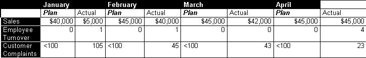
In this chart, there are different categories, plan/actual, and trends. It's all there, but too much to read and understand quickly.
How can you communicate the meaning of many, dissimilar measures at a glance for people unfamiliar with the details? Use a picture. Highlight the exceptions. Then spend your time on the exception issues, not on explaining the chart.
The technique shown below is ideal for showing the status of many, dissimilar numbers at the same time. Use this for the Executive Overview. Exceptions that demand attention will quickly pop out.
A black circle means real problems.![]()
A gray circle means "watch me".
And a clear circle means performance is equal to or better than plan.![]()
Here's an example showing the same information in the table:
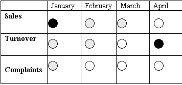
Without knowing the specifics, anyone could quickly understand that: